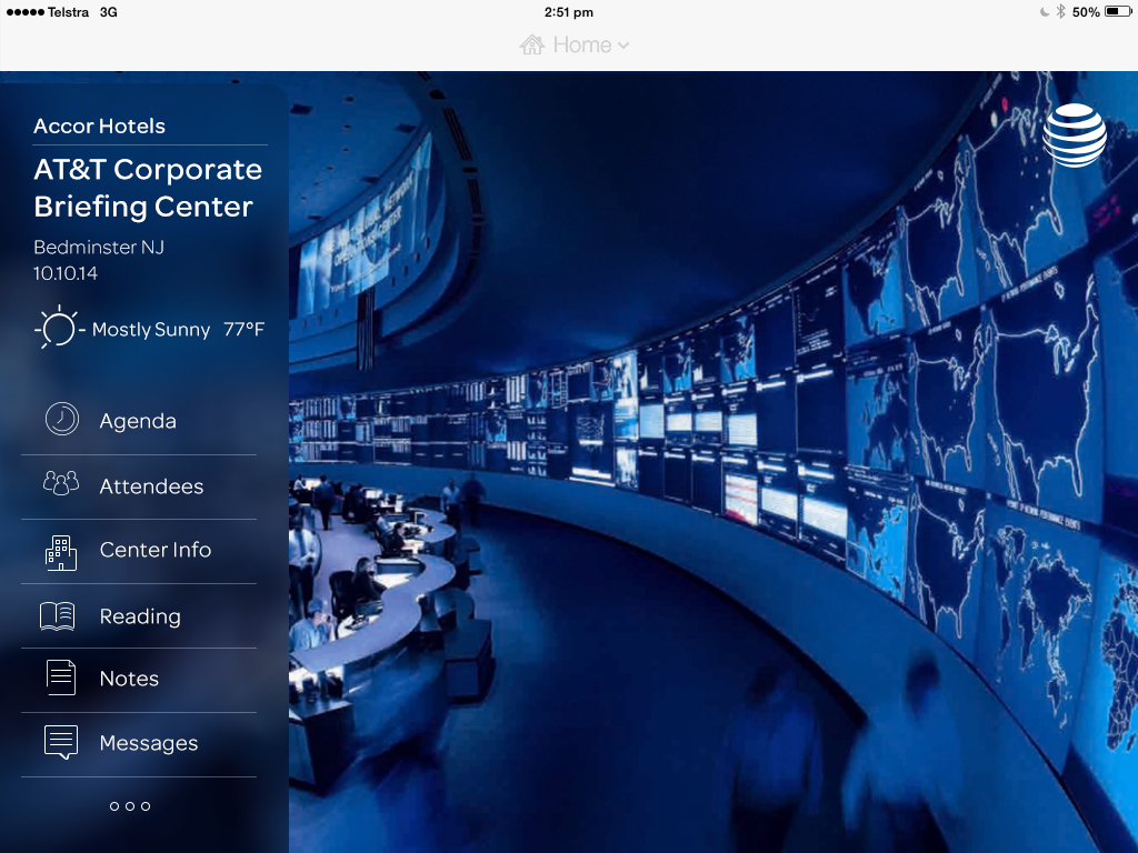
The Brief
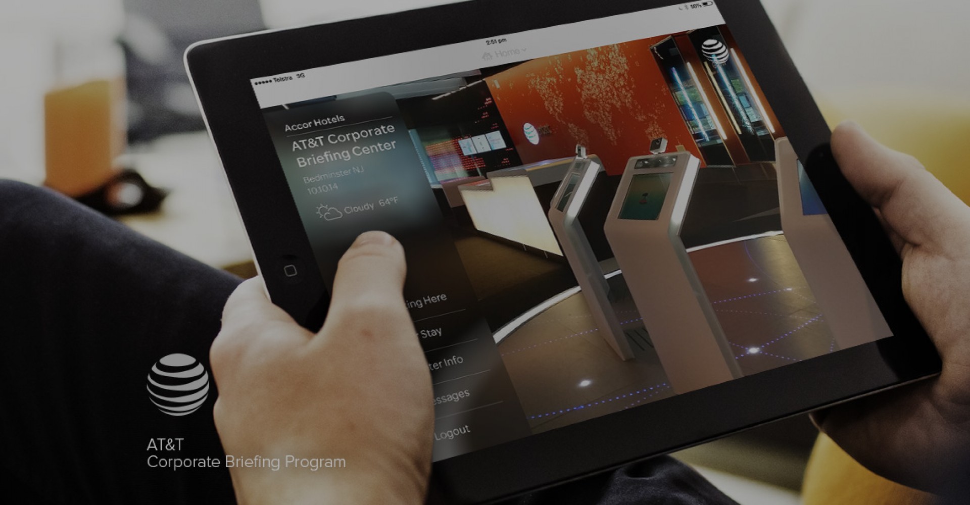
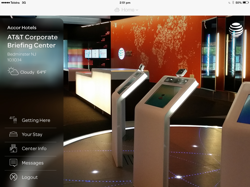
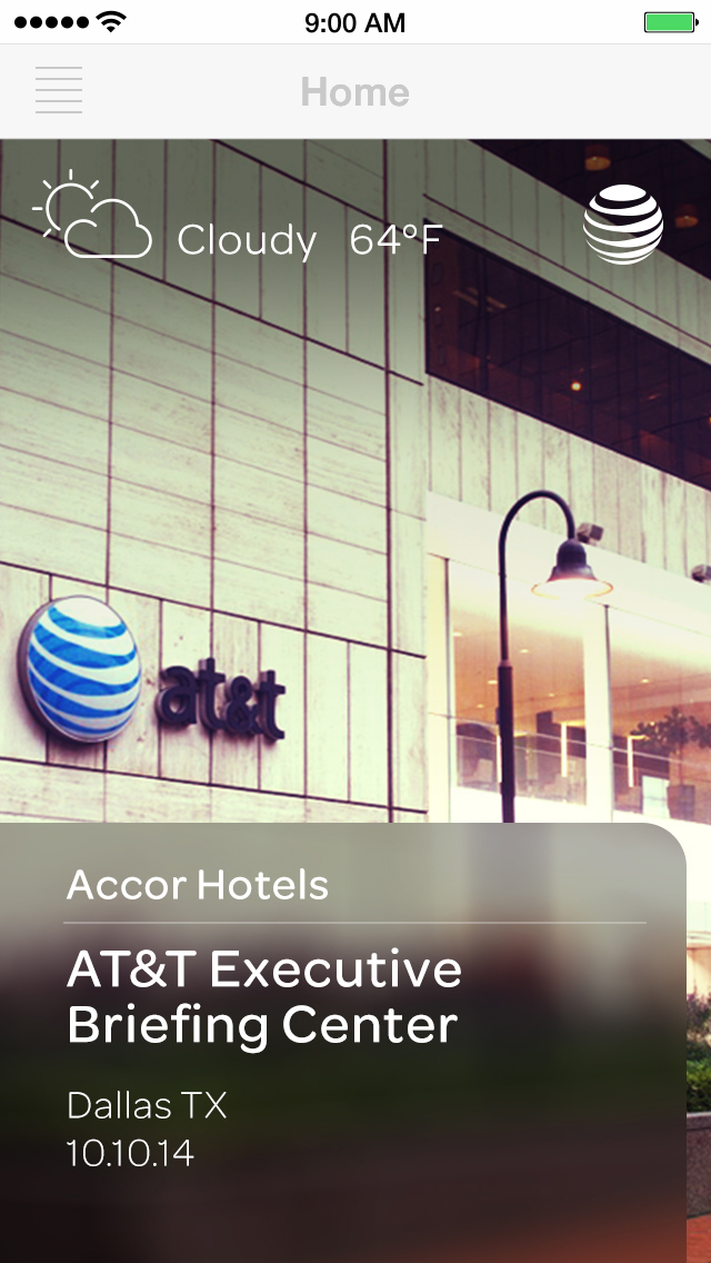
Working as a consultant for one of AT&T's digital vendors I was tasked with designing the experience of a responsive HTML app built within an iOS app architecture. The client was very clear in their brief – they wanted a beautiful app that would provide information to their Corporate Briefing Program visitors, that also showcased the 3 outstanding campuses that hosted the seminars. Users would need information about agendas, speakers and other participants, but would also experience the architecture of the spaces even before they walked through the front door. The client wanted the app to function almost like a conciérge that would provide information to help and guide visitors throughout their journey.
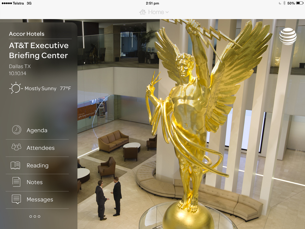
On top of this the app needed to be responsive and work on Tablet and Mobile, and it also needed to be temporally contextual, providing preliminary information before the visitors attended the sessions, with more extensive details on the day of the seminar.
The Process
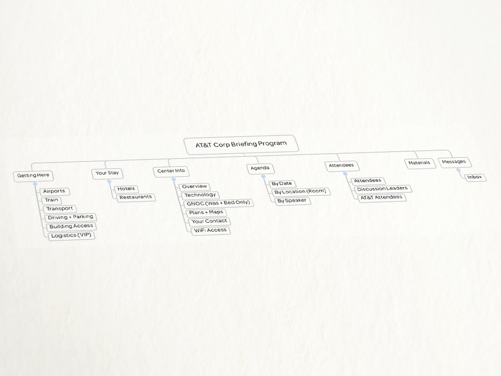
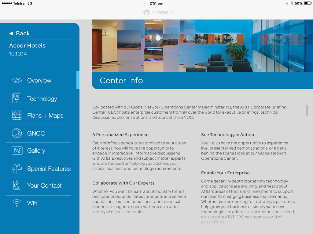
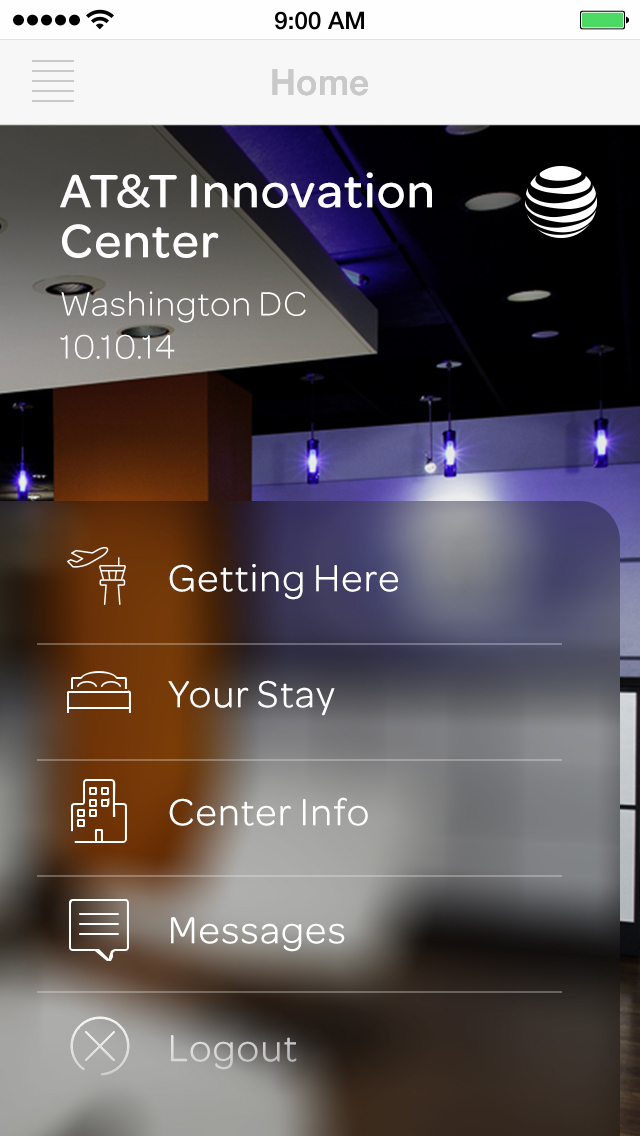
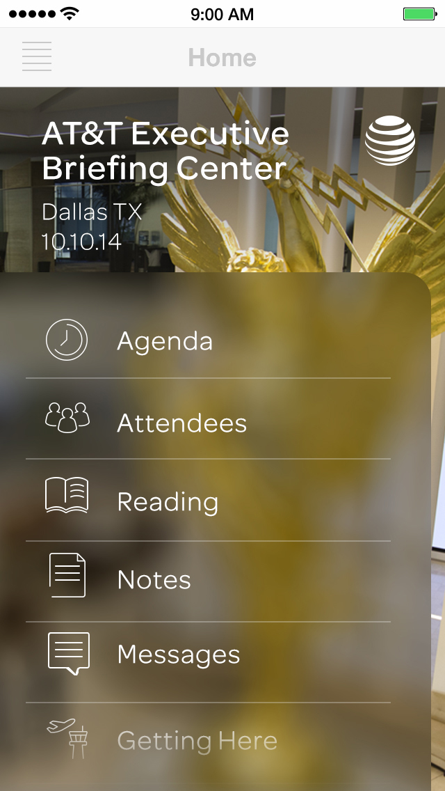
This presented a challenge from a users perspective as the information would change, depending on the context. Before the day the app would provide information about travelling to your nominated campus, accommodation and dining options, information on the centre itself, required pre-reading, and a messaging service with messages from staff at your host centre. On the day the app would display a detailed agenda, information about other participants in your group, and documents and notes.
To tackle this possible comprehension disaster I had to create a simple and easily understood IA that could cope with new items being added into it without breaking the users understanding and anchoring.
