The Brief
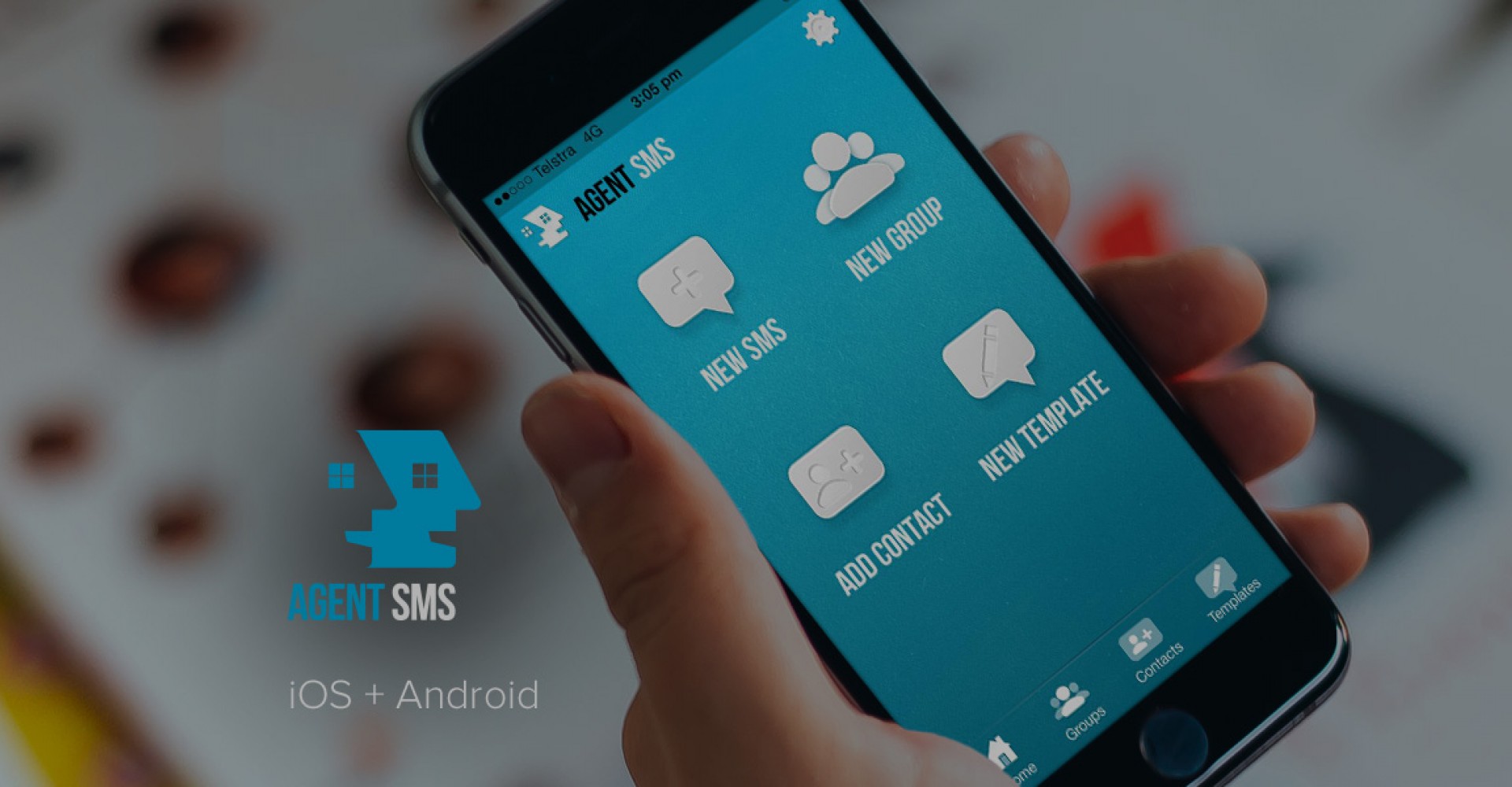
I was approached by Trevor at AgentSMS with an idea for a mobile app to help real estate agents manage and simplify their marketing communications. Trevor had an idea that the SMS marketing channel was largely untapped and that a new model for effective and efficient customer interaction was possible in this medium
The Process
Research
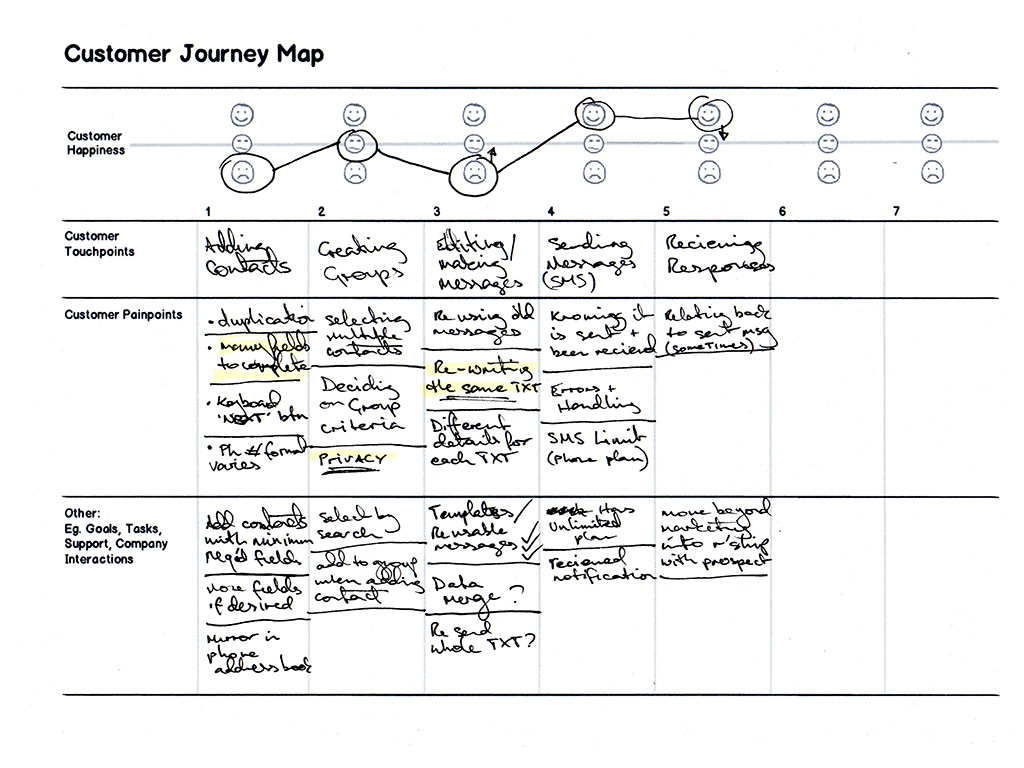
To validate if the idea had legs, I started the process with inquiry into the goals and pain-points real estate agents had with existing methods of marketing and communication.
What was discovered through interviews with agents was that many had unlimited SMS plans on their work phones, and that they often had existing web-based SMS marketing systems that were expensive, tedious, and consequently unused.
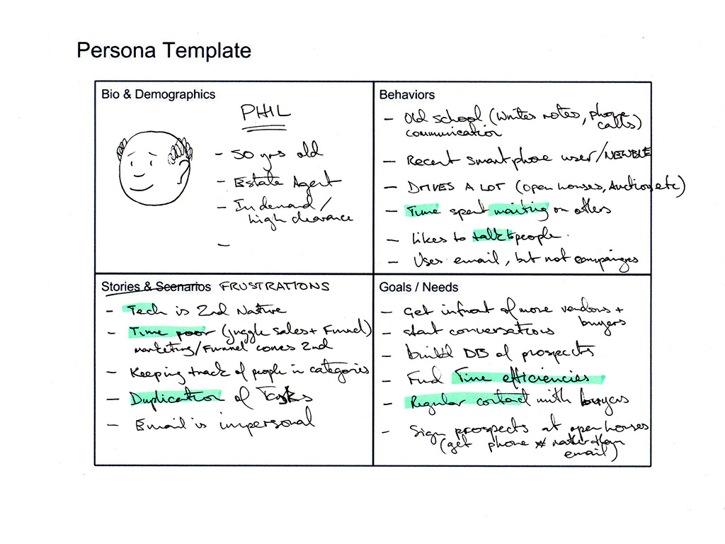
I also discovered that they average agent was very time poor – as the majority of their daily activity involved 'pressing the flesh' and meeting with vendors in person, as well as talking with prospective buyers on the phone. Agents were fiercely protective of their contact lists and often took them with them when moving from agency to agency, and perceived this to be like 'their property'.
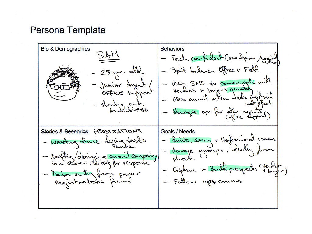
Another point was that almost all agents worked in pairs, with different task being carried out by each agent.
I researched the competition to find out which features of both direct and indirect competitors the agents were familiar with and also discovered some of the things that frustrated them with existing systems.
All of this information was collected, mapped, analysed and synthesised into two personas, a primary and a secondary to represent the types of roles, tasks and mindsets that had been discovered.
Ideation
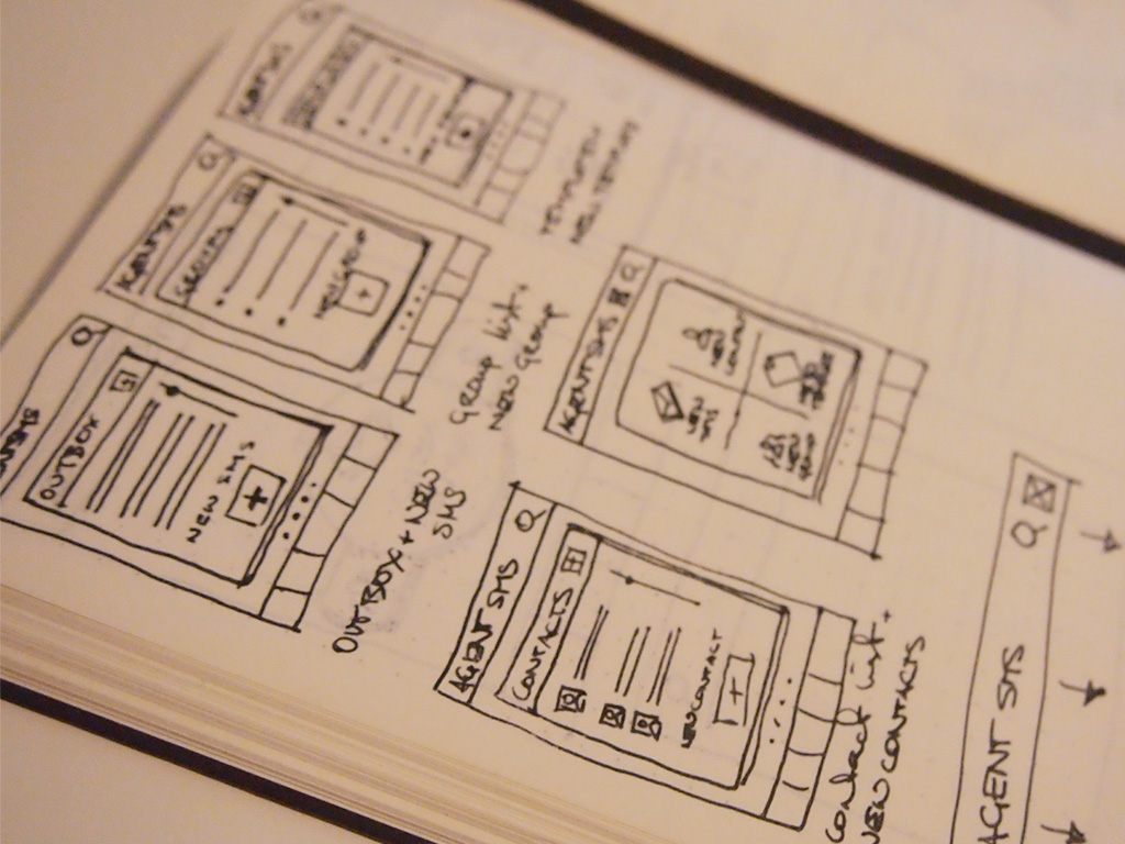
Once we understood the types of tasks, frustrations and aims our users had it was time to hit the sketchbook and come up with a range of ideas of how we could solve their various problems.
Ideation took a range of forms from mapping out a hypothetical day i the users life based on, to mapping out the tasks required, and eventually interface design ideas and flows.
Thinking big, some features that were conceived were unlikely to be realised but it was important to get the ideas down and see what other concepts they could prompt.
Once a range of features were outlined, a process of refinement began where these ideas were presented to the client and users and feedback was given. We also investigated the feasibilty of the features, and in this way an experience was defined that was achievable, viable and desireable.
Defintion
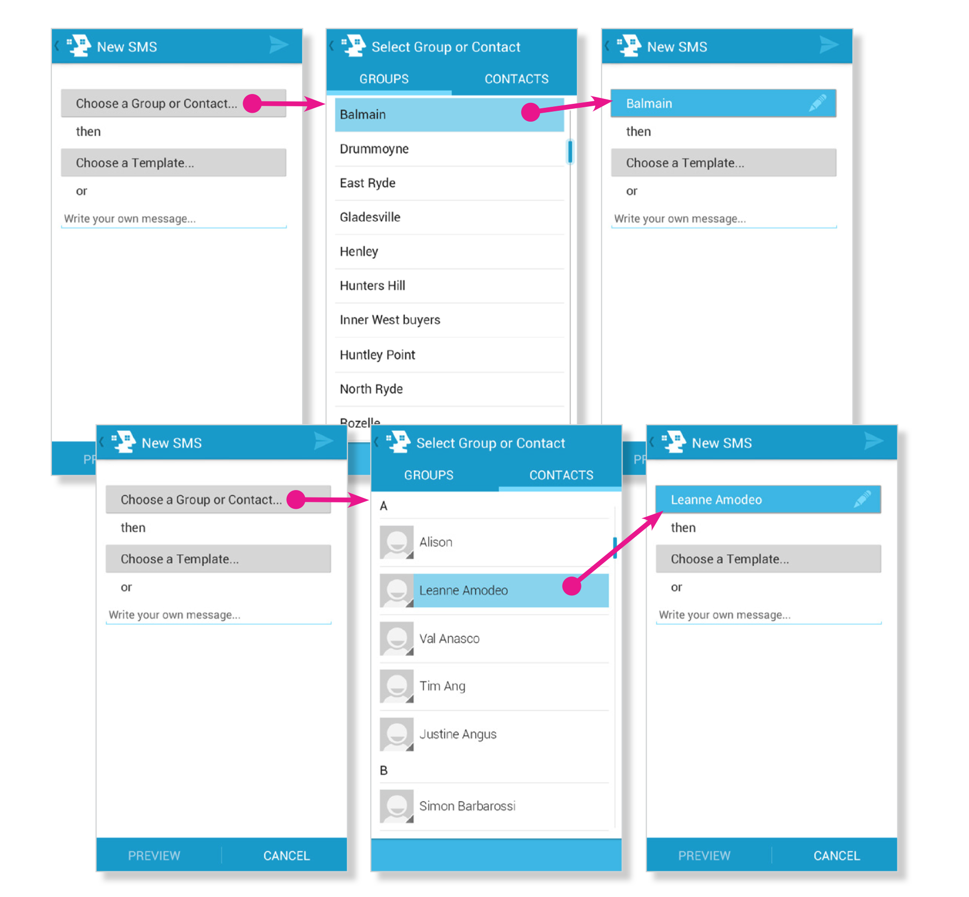
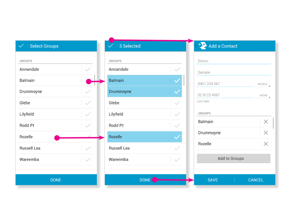
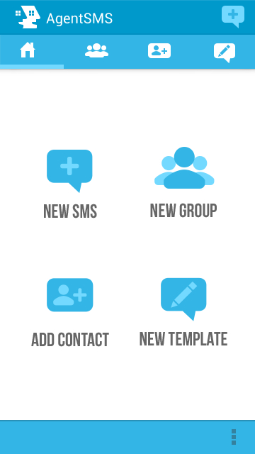
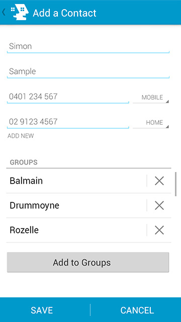
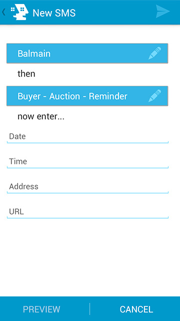
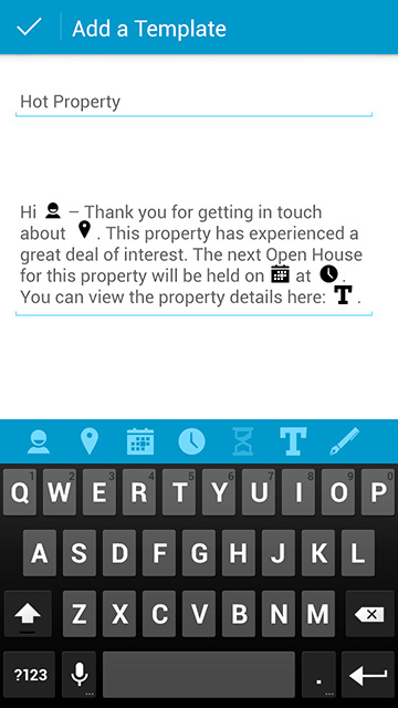
The experience that emerged allowed users to create contacts and groups of contacts, and send SMS message to contacts or groups by using either a pre-made template where the user would only have to add a few data points, or writing a free-form message. In this way we could deliver efficiency and flexibility. All contacts added would be stored not only in the system but also in the phones native contact list, allowing calls and portability of information.
As part of this definition phase I produced a prototype that could be used for usability testing, and also for communicating how the product would work to both the client and the development vendor.
Production
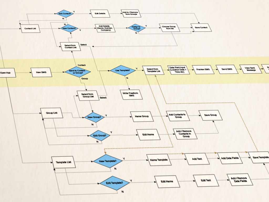
The next step was to define all the steps and interactions of each part of the experience. mapping out the flows and how users would achieve both individual tasks, and broader arcs made from a number of steps that delivered the primary functions of the product.
I then moved on to visual design of first iOS and then Android versions of the app, using native patters that would be familiar to users of each operating system. Out of these designs assets were produced and delivered to the developers. I was involved throughout the development in providing quality assurance and testing.
